TL;DR — Quick Summary
Mobile scores are lower because Lighthouse applies 4× CPU throttling and simulated slow 4G (1.6 Mbps down, 150ms RTT) — this punishes JavaScript-heavy sites disproportionately. Desktop Lighthouse uses no throttling. The fix isn't 'optimize for mobile' as an afterthought — it's reducing total JavaScript below 300KB, serving responsive images (not 2000px originals to 375px screens), inlining critical CSS, deferring non-essential scripts, and ensuring tap targets are 48×48px minimum. Quick wins: 1) Reduce JavaScript execution — every KB costs 2–3× more time on mobile CPUs. 2) Serve WebP/AVIF images at responsive sizes. 3) Preload the LCP element with `fetchpriority="high"`. 4) Defer all third-party scripts (chat, analytics, remarketing) until after first interaction. 5) Remove intrusive interstitials — Google penalizes full-screen mobile popups. 6) Use `font-display: swap` and preload critical fonts. 7) Reserve space for ads/embeds to prevent CLS. 8) Monitor CrUX mobile field data — Google ranks using the 75th percentile of real mobile users, not lab scores. Speed plugins and 'optimization' apps almost never fix the root causes — they add more JavaScript to solve JavaScript problems.
Key Takeaways
- ✓Lighthouse mobile scores are 20–40 points lower than desktop because of 4× CPU throttling and simulated slow 4G — this is by design, not a bug.
- ✓The speed-to-bounce curve is exponential, not linear: bounce probability increases 32% from 1→3s, 90% from 1→5s, and 123% from 1→10s on mobile.
- ✓JavaScript is the #1 mobile performance killer — every KB costs 2–3× more execution time on mobile CPUs vs desktop, and the average site ships 500KB+ of JS.
- ✓Performance plugins and speed optimization apps almost always make things worse — they add JavaScript to solve JavaScript problems, increasing total bundle size.
- ✓Google's Page Experience ranking signal evaluates mobile CWV, mobile-friendliness, HTTPS, and intrusive interstitials — all at the URL level, not site level.
- ✓Mobile usability requirements (48×48px tap targets, 16px+ base font, no horizontal scroll) are separate from CWV but equally important for rankings.
- ✓CrUX field data uses real mobile users on real devices — your p75 mobile LCP may be 2× worse than lab scores suggest because of device diversity.
- ✓Full-screen mobile popups (intrusive interstitials) are penalized by Google — replace with banners under 30% of screen height or inline CTAs.
Why Mobile Lighthouse Scores Are Always Lower Than Desktop
If you've ever run a PageSpeed Insights test and seen a mobile score 20–40 points below desktop, you're not alone — this is universal. Understanding why is the first step to fixing it.
Lighthouse throttling explained: Lighthouse applies two layers of throttling for mobile analysis that it does NOT apply for desktop:
1. CPU throttling (4× slowdown): Lighthouse artificially slows down your CPU by a factor of 4 to simulate a mid-tier mobile device (roughly equivalent to a Moto G Power). A JavaScript task that takes 50ms on your development machine takes 200ms under Lighthouse mobile throttling. This is why JavaScript-heavy sites see the biggest mobile-desktop score gap.
2. Network throttling (simulated slow 4G): Lighthouse simulates a mobile network connection: 1.6 Mbps download, 750 Kbps upload, 150ms RTT (round-trip time). On desktop, Lighthouse uses your actual network connection. A 500KB JavaScript bundle that downloads in 50ms on desktop takes 2.5 seconds on simulated slow 4G.
The compounding effect: These two throttling layers compound: a resource that takes longer to download (network throttling) ALSO takes longer to parse and execute (CPU throttling). A 300KB JavaScript bundle that takes 100ms total on desktop might take 800ms+ on simulated mobile — 8× worse.
Real-world validation: Lighthouse's throttling isn't arbitrary. Google's HTTPArchive data shows the median mobile device globally has roughly 1/4 the processing power of a median desktop and uses cellular connections with 50–150ms latency. The throttling mirrors real-world conditions for the majority of mobile users worldwide — not just users on flagship phones with 5G.
The metrics most affected:
- •LCP: Slower resource download + slower rendering = 1.5–3× worse on mobile
- •INP: CPU throttling makes every event handler 4× slower, pushing interactions past the 200ms threshold
- •CLS: Mobile viewports are narrower, so layout shifts are proportionally larger
- •TBT (Total Blocking Time): The single most impacted metric — JavaScript Long Tasks multiply by 4× under CPU throttling
Mobile vs Desktop Core Web Vitals: The Real-World Gap
Lab throttling explains the Lighthouse score gap, but field data (CrUX) shows an even more important picture: how real users experience your site on mobile.
The field data gap is worse than lab: According to CrUX data analyzed by Google, the median website has a mobile LCP that is 1.8× worse than desktop LCP. For INP, mobile is 2.1× worse. CLS is typically closer (1.2× worse) because layout shifts are layout-driven, not CPU-driven.
Why field data diverges from lab:
- •Device diversity: Lab tests simulate one device profile. Real users visit on everything from a $50 budget phone to a flagship iPhone. The p75 (75th percentile) that Google uses for ranking reflects the experience of your slowest 25% of users.
- •Network diversity: Lab simulates one network speed. Real users range from fast Wi-Fi to congested 3G in rural areas. A site that passes LCP in the lab may fail in the field because 25% of your mobile users are on slow connections.
- •Geographic diversity: Users in different regions have different network infrastructure. A site hosted in US-East serving users in Southeast Asia has 200–400ms of unavoidable latency.
- •Concurrent usage: Real mobile devices are running background apps, receiving notifications, and competing for CPU/memory. Lab environments are clean.
How Google evaluates mobile CWV for ranking: Google uses the p75 of mobile CrUX data as the ranking signal. This means:
- •If 75% of your mobile users have an LCP under 2.5s, you pass — even if 25% don't
- •Mobile and desktop are evaluated separately — passing desktop CWV doesn't help your mobile rankings
- •Google groups pages by URL pattern for evaluation, so your product pages may pass while your blog pages fail
The business impact of the mobile gap: Mobile users have lower patience thresholds than desktop users. Google's research found that 53% of mobile visits are abandoned if a page takes more than 3 seconds to load. Desktop users are more tolerant (the threshold is closer to 5 seconds). This means mobile performance has a disproportionate impact on conversion rates.
The Speed-to-Bounce Curve: Understanding the Exponential Relationship
The relationship between page load time and bounce rate is not linear — it's exponential. Understanding this curve is critical for prioritizing optimization work.
The data: Google's analysis of 11 million mobile pages found:
- •1s → 3s load time: Bounce probability increases 32%
- •1s → 5s load time: Bounce probability increases 90%
- •1s → 6s load time: Bounce probability increases 106%
- •1s → 10s load time: Bounce probability increases 123%
What the curve means for optimization: The steepest part of the curve is between 1 and 5 seconds. Going from 5s to 3s has a dramatically larger impact on bounce rate than going from 3s to 1s. This means:
- •If your mobile load time is 6+ seconds, any improvement will have significant ROI
- •If you're at 3–5 seconds, you're in the 'danger zone' where small improvements yield big behavior changes
- •If you're under 2 seconds, further speed gains have diminishing returns on bounce rate (but still help SEO)
Industry-specific bounce rate benchmarks (mobile):
- •E-commerce: Average mobile bounce rate 45–55%. Target: under 40%
- •B2B/SaaS: Average 55–65%. Target: under 50%
- •Media/Content: Average 40–50%. Target: under 35%
- •Lead gen/Services: Average 50–60%. Target: under 45%
Diagnosing high mobile bounce rate: High bounce rate isn't always a speed problem. Diagnose systematically:
- 1Compare mobile vs desktop bounce rate: If mobile is 15+ points higher, speed is likely a factor
- 2Segment by landing page: If specific pages bounce more, check their individual load times
- 3Check above-the-fold content: Users decide to stay or leave based on what they see in the first viewport. If the LCP element is slow, users see a blank or partially-loaded page and leave
- 4Review intrusive interstitials: Full-screen popups on mobile cause immediate bounces independent of speed
- 5Check content-intent alignment: Users who land on a page that doesn't match their search intent bounce regardless of speed — this is a content problem, not a performance problem
Why Performance Plugins and Speed Apps Don't Fix the Real Problems
Every CMS ecosystem has a cottage industry of 'speed optimization' plugins, apps, and tools that promise to fix performance with a single install. In our experience optimizing hundreds of sites, these almost never fix the root causes and often make things worse.
The fundamental paradox: Performance plugins are JavaScript. They add code to your site to 'optimize' code on your site. A plugin that promises to 'defer JavaScript' adds its own JavaScript to manage the deferral. A plugin that 'lazy-loads images' adds a JavaScript library that intercepts image loading. The net effect is often negative:
- •Plugin JS bundle: +50–200KB
- •Plugin's DOM manipulation: +50–200ms execution time
- •Deferred scripts now load later but still load: total JS unchanged
- •False sense of optimization: real problems remain unaddressed
What plugins typically do vs. what's needed:
- •Image 'optimization' plugins: Compress images on upload (useful) but don't fix the core issue: serving 2000px images to 375px mobile screens. You need responsive `srcset`, not just compression.
- •Caching plugins: Useful for CMS sites (especially WordPress), but they don't reduce JavaScript execution time, which is the primary mobile bottleneck.
- •'Minification' plugins: Reduce file sizes by 5–15% — meaningful for very large files, but a rounding error compared to not loading the file at all.
- •'Render-blocking removal' plugins: Defer scripts, but often break functionality. The real fix is reducing the number of scripts, not deferring all of them.
- •'Performance score booster' plugins: Some plugins detect Lighthouse and serve an optimized version only to testing tools — this gaming doesn't help real users.
What actually fixes mobile performance:
- 1Remove unnecessary scripts entirely — don't defer them, delete them
- 2Serve responsive images with `srcset` and `sizes` — not just compressed originals
- 3Reduce third-party scripts — each chat widget, analytics tool, and remarketing pixel costs 100–500ms on mobile
- 4Inline critical CSS — render above-the-fold content without waiting for external stylesheets
- 5Preload the LCP element — tell the browser what to prioritize
- 6Use a CDN — reduce latency for static assets
- 7Reduce DOM size — mobile browsers struggle with 1500+ DOM elements
Google's Page Experience Ranking Signal: Complete Breakdown
Page Experience is Google's umbrella term for user experience signals that affect rankings. Understanding exactly what's included — and what's not — prevents wasted optimization effort.
The five Page Experience signals:
1. Core Web Vitals (most impactful):
- •LCP ≤ 2.5s (measures loading speed)
- •INP ≤ 200ms (measures interactivity/responsiveness)
- •CLS ≤ 0.1 (measures visual stability)
- •Evaluated per URL, using CrUX field data at the 75th percentile
- •Mobile and desktop evaluated separately
2. Mobile-friendliness:
- •Responsive design that adapts to any viewport
- •Text readable without zooming (16px+ base font)
- •Tap targets at least 48×48px with 8px spacing
- •No horizontal scrolling required
- •Content fits within the viewport
3. HTTPS:
- •Entire site served over HTTPS (no mixed content)
- •Valid SSL certificate
- •HTTP-to-HTTPS redirects in place
4. No intrusive interstitials:
- •No full-screen popups that block content on mobile
- •No standalone interstitial pages before content
- •Banners must use <30% of screen height
- •Exceptions: Cookie consent, age verification, and legal notices are not penalized
5. Safe Browsing:
- •No malware, deceptive content, or unwanted software
- •No social engineering attacks
How Page Experience affects rankings: Page Experience is a tiebreaker, not a dominant signal. Content relevance, backlinks, and topical authority still matter far more. But in competitive SERPs where multiple pages have similar content quality, Page Experience can determine who ranks #3 vs #8. For local businesses and e-commerce, where competitors often have similar content, Page Experience matters more.
Struggling with Mobile & UX speed?
Our team optimizes Mobile & UX sites for real-world results. Request an audit.
Mobile Usability Optimization: The Complete Checklist
Mobile usability is a Page Experience signal evaluated separately from Core Web Vitals. Failing mobile usability can hurt your mobile rankings even if you pass all three CWV metrics.
Viewport configuration:
Every mobile-optimized page must include: `<meta name="viewport" content="width=device-width, initial-scale=1">`
Common mistakes:
- •Missing the viewport meta tag entirely (page renders at desktop width on mobile)
- •Setting `maximum-scale=1` or `user-scalable=no` — this prevents zoom and causes accessibility violations
- •Using fixed-width containers that don't adapt to viewport
Typography requirements:
- •Base font size: 16px minimum (prevents iOS auto-zoom on form inputs)
- •Line height: 1.5 for body text (readability on small screens)
- •Heading scale: Reduce desktop heading sizes by 20–30% for mobile
- •Don't rely on `overflow: hidden` to hide text that doesn't fit — rewrite for mobile
Tap target sizing:
- •Minimum size: 48×48px (Google's requirement)
- •Minimum spacing: 8px between adjacent tap targets
- •Common violations: Navigation links too close together, footer link lists, inline text links without padding
- •Form elements (checkboxes, radio buttons) must meet 48×48px including their label area
Content layout:
- •No horizontal scrolling at any viewport width (320px to 428px)
- •Tables must be responsive: use horizontal scroll containers or restructure as stacked cards on mobile
- •Embedded content (iframes, videos) must be responsive with `max-width: 100%` and `aspect-ratio`
- •Images must not overflow their containers
Forms on mobile:
- •Use appropriate input types: `type="email"` (shows @ keyboard), `type="tel"` (shows number pad), `type="number"` (shows number keyboard)
- •Use `autocomplete` attributes for faster form completion
- •Labels above inputs (not beside) on mobile viewports
- •Error messages must be visible without scrolling
Navigation on mobile:
- •Hamburger menus are acceptable but must be discoverable
- •Mega menus should collapse to accordion patterns on mobile
- •Sticky navigation must not consume more than 10% of viewport height
- •Back/close buttons must be easily tappable (48×48px minimum)
Intrusive Interstitials: What Google Penalizes and Compliant Alternatives
Google actively penalizes pages with intrusive interstitials on mobile. This penalty was introduced in 2017 and remains a Page Experience signal in 2026.
What gets penalized:
- •Full-screen popups that cover the main content immediately on page load
- •Standalone interstitial pages that users must dismiss before seeing content
- •Above-the-fold layouts where an interstitial dominates and the original content is pushed below the fold
What does NOT get penalized:
- •Cookie consent banners (legally required in many jurisdictions)
- •Age verification gates (legally required for age-restricted content)
- •Login walls for private content (paywalls, member-only areas)
- •App install banners that use the browser's native banner format and are 'easily dismissible'
Compliant alternatives that convert:
- •Small top/bottom banners (<30% of screen): Effective for email signups. Use `position: sticky` at the bottom of the viewport with a clear close button.
- •Inline CTAs within content: Place signup forms or promotional boxes between content sections. These feel natural and don't trigger penalties.
- •Scroll-triggered slide-ins: Small overlays that appear from the corner after 50%+ scroll depth. Non-intrusive and high-converting.
- •Exit-intent popups (desktop only): These aren't penalized because they only appear when users are leaving. However, they don't work on mobile (no 'exit intent' on touch devices).
- •Time-delayed modals (with caution): Popups that appear after 30+ seconds of engagement. Google's documentation is ambiguous on these — err on the side of banners instead.
Implementation best practices:
- •Always include a clearly visible close button (X) with a 48×48px tap target
- •Never auto-refresh or re-display a dismissed interstitial
- •Use `localStorage` to remember dismissals across sessions
- •A/B test banners vs. inline CTAs — banners often convert better without the penalty risk
- •For email collection, consider using a banner that expands on tap rather than a popup
Fixing the Mobile-Desktop CWV Gap: Practical Optimization Workflow
Now that you understand why mobile scores are lower, here's the systematic workflow to close the gap.
Step 1: Quantify the gap Run PageSpeed Insights on your top 5 pages. Record both mobile and desktop scores for each. Calculate the gap. If the average gap is:
- •5–15 points: Minor tweaks needed (image optimization, font loading)
- •15–30 points: Moderate work (JavaScript reduction, critical CSS, third-party script management)
- •30+ points: Major intervention required (architecture changes, script audit, complete image pipeline overhaul)
Step 2: Identify mobile-specific bottlenecks Open Chrome DevTools → Performance tab → Enable CPU throttling (4× slowdown) → Record a page load. Look for:
- •Long Tasks (red bars): Any task over 50ms blocks interactivity. On mobile with 4× throttling, a 15ms desktop task becomes a 60ms Long Task
- •Layout shifts: Filter the Performance tab for 'Layout Shift' events. Check if they're caused by images without dimensions, late-loading fonts, or dynamic content insertion
- •Network waterfall: Look for resources that are render-blocking or loading sequentially when they could be parallel
Step 3: Fix JavaScript (biggest mobile impact)
- •Audit total JS: Use Chrome DevTools Coverage tab. If >50% of loaded JavaScript is unused on a given page, you're shipping too much
- •Split bundles by page: Don't load product page JS on the blog, don't load blog JS on the homepage
- •Defer third-party scripts: Move analytics, chat, remarketing to load after `DOMContentLoaded` or on user interaction
- •Use `import()` for dynamic imports: Load non-critical modules only when needed
- •Target: <200KB total JS on mobile pages (compressed/transferred size)
Step 4: Fix images (second biggest mobile impact)
- •Serve responsive images: `
<img srcset="small.webp 400w, medium.webp 800w, large.webp 1200w" sizes="(max-width: 768px) 100vw, 50vw">` - •Convert to WebP/AVIF (30–70% smaller than JPEG/PNG)
- •Preload the LCP image: `
<link rel="preload" as="image" href="hero.webp" fetchpriority="high">` - •Lazy-load all below-fold images: `loading="lazy"`
- •Set explicit `width` and `height` attributes to prevent CLS
Step 5: Fix CSS delivery
- •Inline critical above-the-fold CSS in `
<head>` (<15KB) - •Load the full stylesheet asynchronously: `
<link rel="stylesheet" href="styles.css" media="print" onload="this.media='all'">` - •Use `font-display: swap` for all custom fonts
- •Preload critical fonts: `
<link rel="preload" as="font" type="font/woff2" href="font.woff2" crossorigin>`
Step 6: Fix mobile-specific UX issues
- •Ensure all tap targets are 48×48px with 8px spacing
- •Remove or replace intrusive interstitials with compliant banners
- •Simplify mobile navigation (collapse mega menus to accordions)
- •Reduce DOM complexity — mobile browsers struggle with 1500+ elements
Mobile Landing Page Optimization for Conversion
Mobile landing pages have unique constraints that desktop-first designs ignore. Optimizing for mobile conversions requires rethinking layout, content priority, and interaction patterns.
Above-the-fold on mobile (first 600–700px): Mobile users decide to stay or leave based on what they see in the first viewport — typically 375×667px (iPhone) or 360×800px (Android). This space must contain:
- •Clear headline that matches the ad/search intent
- •Value proposition in 1–2 lines
- •Visual proof (hero image, trust badge, or social proof)
- •A visible CTA button (not below the fold)
Mobile CTA optimization:
- •Use full-width CTA buttons on mobile (easier to tap)
- •Sticky CTA bars at the bottom of the viewport (always accessible)
- •Button text should be action-oriented: 'Get My Free Quote' not 'Submit'
- •Minimum CTA height: 48px (Google's tap target requirement)
- •High-contrast colors that pass WCAG AA (4.5:1 ratio)
Form optimization for mobile:
- •Reduce form fields to the absolute minimum (every field reduces conversion by 5–10%)
- •Use single-column layouts — never side-by-side fields on mobile
- •Auto-fill/autocomplete for name, email, phone, address
- •Progressive disclosure: show additional fields only after initial engagement
- •Real-time validation (don't wait for form submission to show errors)
Content structure for mobile:
- •Short paragraphs (2–3 sentences maximum)
- •Expandable sections (accordions) for detailed information
- •Bullet points over paragraphs for scanning
- •Social proof near the CTA (testimonials, review counts, trust badges)
- •Clear visual hierarchy using typography scale (not color alone)
Speed requirements for mobile landing pages:
- •Target load time: under 2 seconds (mobile landing pages have lower patience thresholds than content pages)
- •Total page weight: under 1MB (including all images, scripts, and fonts)
- •No third-party scripts that aren't essential for conversion tracking
- •Preload the hero image and critical fonts
- •Inline all CSS (landing pages are single-page, so external stylesheets add unnecessary round-trips)
Advanced: Mobile Performance Monitoring and RUM
Lab testing tells you what could happen on mobile. Real User Monitoring (RUM) tells you what actually happens. For serious mobile optimization, you need both.
Setting up mobile-specific RUM: Google's web-vitals library provides easy CWV collection:
import {onLCP, onINP, onCLS} from 'web-vitals';
function sendToAnalytics(metric) { const body = JSON.stringify({ name: metric.name, value: metric.value, rating: metric.rating, navigationType: metric.navigationType, // Add device info deviceType: /Mobile|Android|iPhone/i.test(navigator.userAgent) ? 'mobile' : 'desktop', connection: navigator.connection?.effectiveType || 'unknown', deviceMemory: navigator.deviceMemory || 'unknown', }); navigator.sendBeacon('/analytics', body); }
onLCP(sendToAnalytics); onINP(sendToAnalytics); onCLS(sendToAnalytics);
Key mobile RUM segments to monitor:
- •By connection type: 4G vs 3G vs Wi-Fi performance comparison
- •By device memory: Low-memory devices (<4GB) vs high-memory (8GB+)
- •By geography: Users in different regions experience different latency
- •By page type: Homepage vs product vs checkout vs blog
- •By traffic source: Organic vs paid vs social (different user behavior patterns)
Using CrUX for mobile monitoring:
- •The CrUX Dashboard in Looker Studio shows mobile-specific trends
- •Filter by form factor to see mobile p75 values over time
- •Set up alerts for mobile CWV regressions (e.g., mobile LCP crosses 2.5s threshold)
- •Compare your mobile metrics against CrUX BigQuery origin-level data for competitive benchmarking
Actionable RUM insights:
- •If mobile LCP is 2× worse than desktop LCP → image pipeline problem (not serving responsive sizes)
- •If mobile INP is 3× worse than desktop INP → JavaScript execution problem (too much JS for mobile CPUs)
- •If mobile CLS is similar to desktop CLS → layout issues are viewport-independent (good — fix once, fix everywhere)
- •If 3G users have 4× worse LCP than Wi-Fi users → critical resources are too large (reduce total transfer size)
- •If low-memory devices have poor INP → DOM is too complex or JS memory usage is too high
Thresholds & Benchmarks
| Metric | Good | Needs Improvement | Poor |
|---|---|---|---|
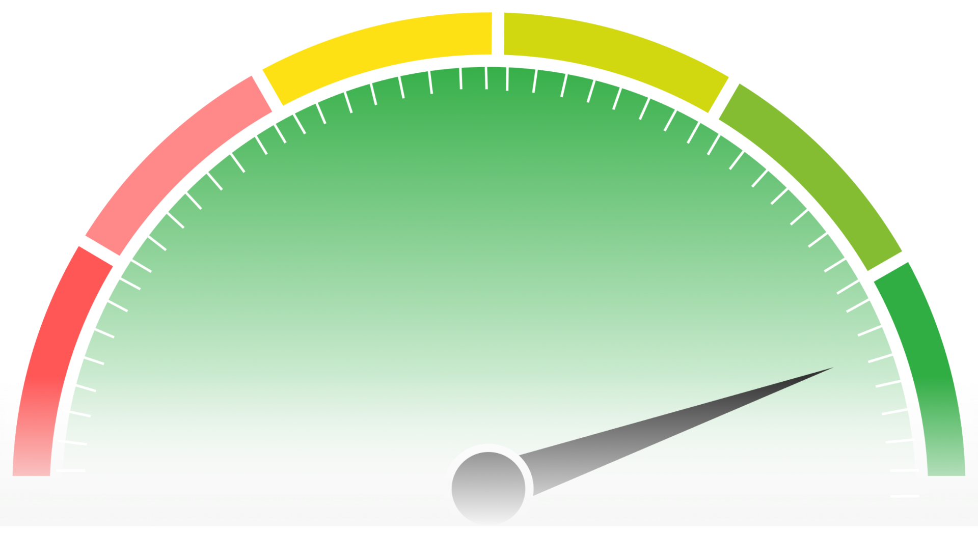
| Mobile Lighthouse Score | 75+ | 45–74 | Below 45 |
| Mobile LCP | ≤ 2.5s | 2.5–4.0s | > 4.0s |
| Mobile INP | ≤ 200ms | 200–500ms | > 500ms |
| Mobile CLS | ≤ 0.1 | 0.1–0.25 | > 0.25 |
| Mobile Bounce Rate | < 40% | 40–60% | > 60% |
| Mobile Page Load Time | < 3s | 3–5s | > 5s |
| Total JavaScript (mobile) | < 200KB | 200–400KB | > 400KB |
| Total Page Weight (mobile) | < 1.5MB | 1.5–3MB | > 3MB |
Key Measurement Tools
PSI defaults to mobile analysis. Shows CrUX field data (what Google uses for ranking) alongside Lighthouse lab data. Always test mobile separately — the results are fundamentally different from desktop.
Reports mobile-specific issues: text too small to read, clickable elements too close together, content wider than screen. These are Page Experience signals separate from CWV.
CPU throttling (4× or 6×) and network throttling (slow 3G, fast 3G) simulate mobile conditions. Use Performance tab with CPU throttling to identify Long Tasks that block mobile interactivity.
Filter CrUX data by form factor (mobile/desktop/tablet). Shows 28-day rolling p75 for each CWV metric on mobile specifically. This is exactly what Google uses for ranking.
Test with real mobile device profiles (Moto G Power, Galaxy S21). Multi-step transaction testing on mobile viewport. Filmstrip comparison between mobile and desktop waterfall.
Segment bounce rate by device category + page to identify which mobile pages lose the most users. Correlate with load time data to find the speed-to-bounce threshold for your audience.
Looking for speed help?
Request An AuditStep-by-Step Optimization Guide
Audit the mobile-desktop score gap
Run PageSpeed Insights on your top 10 pages. Record mobile and desktop scores for each. Calculate the average gap. If it's over 20 points, JavaScript and image delivery are the most likely causes. Export CrUX data to see real-world mobile user experience vs lab predictions.
Profile JavaScript execution on mobile
Open Chrome DevTools → Performance tab → Enable 4× CPU throttling → Record a full page load. Identify all Long Tasks (>50ms blocks, shown as red bars). For each Long Task, check the call stack — is it your code, a third-party script, or framework overhead? Target: zero Long Tasks over 200ms on mobile.
Reduce total JavaScript payload
Use Chrome DevTools Coverage tab to identify unused JavaScript. Remove dead code, split bundles by page type, and defer non-critical scripts. Convert synchronous third-party script loads to async/defer. Target: under 200KB total JavaScript (transferred/compressed) for mobile pages.
Implement responsive image pipeline
Replace all fixed-size images with responsive srcset/sizes. Convert to WebP or AVIF format. Set explicit width and height attributes on all images. Preload the LCP image with fetchpriority='high'. Lazy-load all below-fold images. Target: no image wider than the mobile viewport (typically 375–428px for above-fold).
Optimize CSS delivery for mobile
Extract critical above-the-fold CSS (under 15KB) and inline it in the <head>. Load the full stylesheet asynchronously. Preload critical web fonts with font-display: swap. Remove unused CSS rules. This eliminates render-blocking and ensures the first paint happens before external resources arrive.
Fix mobile usability issues
Audit all tap targets for 48×48px minimum size with 8px spacing. Ensure base font is 16px+. Remove horizontal scrolling. Replace full-screen mobile popups with compliant banners (<30% screen height). Use Google Search Console's Mobile Usability report to find remaining issues.
Set up mobile-specific monitoring
Implement the web-vitals library with device-type segmentation. Set up CrUX Dashboard filtered to mobile form factor. Create alerts for mobile CWV threshold crossings. Monitor mobile bounce rate by landing page in Google Analytics. Review weekly and correlate speed changes with behavior changes.
Optimize mobile landing pages
Ensure above-the-fold content (headline, value prop, CTA) renders within 2 seconds on mobile. Use full-width CTA buttons. Minimize form fields. Inline all CSS for single-page landing pages. Remove non-essential third-party scripts. Target: under 1MB total page weight, under 2s load time.
Want us to handle these optimizations?
Request an audit for your Mobile & UX site and see results in days, not months.
Mobile & UX in 2026: Updates & Future Trends
Mobile performance in 2026 and beyond:
Google's Interaction to Next Paint (INP) metric replaced FID in March 2024, and its impact on mobile is profound — INP measures every interaction throughout the page lifecycle, not just the first one. Mobile sites with heavy JavaScript now fail INP where they previously passed FID, because mobile CPUs can't process complex event handlers within the 200ms threshold under real-world conditions.
The device gap is narrowing but not closing: mid-tier phones in 2026 are roughly as powerful as flagship phones from 2022, but web pages have grown 35% heavier in the same period. The treadmill continues — faster devices enable heavier pages, which perform poorly on older devices that real users still use.
5G adoption is expanding but hasn't eliminated mobile speed problems: 5G reduces latency and increases bandwidth, but JavaScript execution time is CPU-bound, not network-bound. A site with 500KB of JavaScript will still have a 2+ second INP on a mid-tier phone regardless of connection speed.
Progressive Web Apps (PWAs) are gaining traction as a mobile performance solution — service workers enable offline caching, pre-rendering, and background sync that eliminate many mobile network latency issues. However, PWA adoption remains low (under 5% of top 10,000 sites) due to implementation complexity.
Speculation mode: Google may introduce device-class-specific ranking in future updates — evaluating performance separately for flagship vs budget mobile devices, similar to how they already separate mobile and desktop. This would further reward sites that perform well on low-end hardware.
Need help with Mobile & UX speed?
Our team specializes in Mobile & UX performance optimization. Request an audit and see exactly how much faster your site could be.
View Optimization ServiceFrequently Asked Questions
Lighthouse applies 4× CPU throttling and simulated slow 4G (1.6 Mbps, 150ms RTT) for mobile testing. Desktop uses your actual network and CPU. JavaScript-heavy sites see the biggest gap because every KB of JS costs 2–3× more execution time under mobile throttling.
Yes. Google uses mobile-first indexing (your mobile page is the primary version) and evaluates Core Web Vitals separately for mobile and desktop. Your mobile CWV scores affect your mobile rankings, and desktop CWV scores affect desktop rankings.
Under 3 seconds for most sites, under 2 seconds for landing pages and e-commerce. Google's data shows bounce probability increases 32% when load time goes from 1s to 3s, and 90% from 1s to 5s.
It varies by industry: e-commerce 45–55%, B2B/SaaS 55–65%, media/content 40–50%, lead gen 50–60%. Mobile bounce rates are typically 10–20 percentage points higher than desktop. If your mobile bounce rate is 15+ points above your desktop rate, speed is likely a contributing factor.
Rarely for mobile performance. Most plugins add JavaScript to 'optimize' JavaScript — a net negative. Caching plugins help server response time but don't reduce client-side JavaScript execution (the main mobile bottleneck). Image optimization plugins help with compression but usually don't implement responsive srcset. The most effective approach is removing unnecessary code, not adding more code to manage it.
Speed plugins primarily help with caching (TTFB) and basic minification (5–15% size reduction). Mobile Lighthouse scores are dominated by JavaScript execution time (TBT/INP weighting is 30%+ of the score), and plugins can't reduce the fundamental amount of JavaScript your site loads. In many cases, the plugin itself adds 50–200KB of JS overhead.
Lighthouse simulates a mid-tier mobile CPU by slowing down your computer's CPU by 4×. A JavaScript task taking 50ms on your development machine becomes 200ms under throttling. This simulates real-world conditions — the median global mobile device has ~1/4 the processing power of a typical desktop.
Google uses Core Web Vitals (LCP, INP, CLS) as a ranking signal within Page Experience. Mobile CWV are evaluated separately using real user data (CrUX) at the 75th percentile. Page Experience is a tiebreaker — it matters most in competitive SERPs where content quality is similar across competing pages.
Page Experience is Google's umbrella term for UX signals affecting rankings: Core Web Vitals (LCP ≤ 2.5s, INP ≤ 200ms, CLS ≤ 0.1), mobile-friendliness, HTTPS, and no intrusive interstitials. All five must pass for the full ranking benefit. It's evaluated at the URL level.
Intrusive interstitials are full-screen popups or overlay pages that block content access on mobile. Google penalizes them as part of Page Experience. Exempt: cookie consent, age verification, and login walls for private content. Compliant alternatives: banners under 30% of screen height, inline CTAs, and scroll-triggered corner slide-ins.
Compare mobile vs desktop bounce rate — if mobile is 15+ points higher, speed is likely a factor. Segment by landing page to find the worst offenders. Check if LCP occurs before users decide to leave (within 2.5s). Also check for intrusive interstitials, content-intent misalignment, and above-the-fold content quality — not all bouncing is speed-related.
Google requires tap targets to be at least 48×48 CSS pixels with at least 8px spacing between adjacent targets. Common violations: navigation links too close together, footer link lists, form checkboxes without adequate label padding, and inline text links without padding.
INP measures the time from user interaction to the next paint. On mobile, every event handler takes 2–4× longer to execute due to slower CPUs. Touch events also involve additional processing (touch-to-click delay, scroll disambiguation). Sites with complex JavaScript event handlers that run fine on desktop often exceed the 200ms INP threshold on mobile.
Target under 200KB (transferred/compressed) for mobile pages. The average website ships 500KB+. Every KB of JavaScript costs approximately 2–3× more execution time on mobile CPUs compared to desktop. Chrome DevTools Coverage tab shows how much of your loaded JS is actually used on the current page.
5G reduces network latency and increases bandwidth, which helps with resource download time. But JavaScript execution is CPU-bound, not network-bound. A site with 500KB of JS will still have slow INP on a mid-tier phone regardless of connection speed. 5G helps LCP (faster image downloads) but doesn't help TBT/INP (still limited by device CPU).
No. Google strongly recommends responsive design over separate mobile sites. Separate mobile URLs create duplicate content issues, require additional redirects, split link equity, and double maintenance effort. Google's mobile-first indexing uses the mobile version of responsive sites as the primary version.
Google's research on 11 million mobile pages found that as load time increases from 1s to 3s, bounce probability increases 32%. From 1s to 5s: +90%. From 1s to 10s: +123%. The curve is exponential — the biggest ROI comes from reducing load time below 3 seconds on mobile.
Use Chrome DevTools Device Mode (Ctrl+Shift+M) with CPU throttling (4×) and network throttling (slow 3G or fast 3G). For more accurate results, use WebPageTest with real mobile device profiles. For field data, check CrUX Dashboard filtered to mobile form factor or PageSpeed Insights mobile tab.
Lab tests simulate one device and one network. Field data (CrUX) includes the worst 25% of your real users — people on budget phones, slow networks, and in distant geographic locations. The p75 metric Google uses means 25% of your users have a worse experience than what's reported. See our Measurement Guide for details.
Google requires text to be readable without zooming, which means a minimum base font size of 16px. This also prevents iOS Safari from auto-zooming on form inputs (which happens below 16px). Use relative units (rem) rather than fixed pixels for better accessibility across device sizes.